If you have the new "No Gods, No Masters" Issue of Revolver — which features Chelsea Wolfe and Ghostemane on three collectible covers — then you've seen the fascinating mixed media on board artwork by Jacob Bannon on the last page of the magazine. According to the artist and Converge vocalist, the original, commissioned piece was inspired by Nine Inch Nails' The Downward Spiral, which turns 25 on March 8th.
The album has become one of heavy music's greatest and most influential records, thanks to its artfully constructed abrasiveness and raw beautiful musical and visual statements. Similarly, Bannon is well-known throughout the heavy music community for his iconic Jane Doe artwork, creating stylistically recognizable artwork for many other bands, running the Deathwish Inc. record label and releasing the art book Dunedevil: An Artistic Journey Into Abstraction & Isolation.

His Nine Inch Nails tribute piece is available in Revolver's shop as a stunning collectible 18" x 24" silkscreen poster. Printed by Burlesque of North America, this six-color screen print on white paper is limited to 200 pieces, each of which are hand-numbed, embossed and signed by the artist.
Below, we caught up with Bannon to discuss what The Downward Spiral means to him, how NIN's logo influenced Converge and the painstaking process of creating his tribute artwork. Plus, he shares behind-the-scenes photos of the work-in-progress layers of his gorgeous artwork.

ORDER THE NINE INCH NAILS-INSPRED ART PRINT
ORDER THE FEB/MAR 2019 "THE NO GODS, NO MASTERS" ISSUE

WHAT DOES THE DOWNWARD SPIRAL MEAN TO YOU?
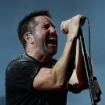
JACOB BANNON Nine Inch Nails for me is an interesting band. They symbolize a lot of different things to me. I was born in 1976, so when they hit with [1989's] Pretty Hate Machine I was in high school and music was everything. I was a metal and a hardcore-punk guy, so I connected with it for sure. But there was part of it that, I guess I was standoffish with because Pretty Hate Machine hit so hard — similarly to how Nirvana hit in pop culture — where it was so affecting that it was changing the course of music and it was changing the vocabulary of music that I was living by and that I just lived for every day. So I listened to it, but I also put it on a shelf because it was something that was ... once it started appealing to pop culture more so than underground culture, I was a music snob. But it was still awesome, I just couldn't show it. I was too young and too dumb. [Laughs]
MTV News dominated everything and it was essentially adorned as the second coming of music. You know, it was deconstruction of heavy music that was occurring and it was in a lot of ways the death rattle for what I knew was metal. Metal was changing, mutating. Grunge was the big, big blow, but this was the secondary blow. There may have been industrial metal, Ministry and Throbbing Gristle that were occurring before, but nothing was as intense and powerful as Nine Inch Nails and really got to those guttural, emotional levels in listeners like they did with Pretty Hate Machine.

So, The Downward Spiral happens and everything changes. It was known that they had the sharpest teeth ever, and it was completely undeniable. It was the kind of record that I listened to that I didn't even talk to other people about how affecting it was, because it was such a popular record that I didn't want to share my experience with it. It was such a personal thing. Everything about this that is substantive is connecting with me — down to the lyrical content, down to just the strange sort of instrumentation, the breakdown of a traditional band, things becoming more electronic. I mean, even the title track basically being a low-fi flip on itself is like completely in the face of all things popular music. It was flipping everything on its head in a really cool way. It may have been playing by the "rules" of the music industry just being a traditional record — but what it was actually doing sonically was everything different and that was really special and enlightening to me.
It was also the time I wanted to be a designer. And, I was just searching for a voice and looking at all these alternative designers. Nine Inch Nails was also speaking a similar language. I liked all of these ideas of visual language becoming textural, becoming more about things that were forgotten, things that were remnants, things that were, I guess, less upfront and forward-facing. Like the typical listener, things that were being created for somebody that had a deeper drive to have a bigger understanding of music and art. That's what I was aspiring to be as a kid.

IT'S INTERESTING YOU SAY THAT BECAUSE OTHER MUSICIANS FOUND THE DOWNWARD SPIRAL'S UNEXPECTED MAINSTREAM HIT DISILLUSIONING OR EMPOWERING. BUT YOU FELT BOTH, AND IT'S ULTIMATELY 65 MINUTES OF NO RULES THAT MADE A MASSIVE CREATIVE IMPACT.
It was the marriage of melody and abrasiveness too that was absent in anything else that that predated it in terms of popular music. It had the teeth, the metal, but it had the human melody that kind of strikes all of us when you hear a great song. That's why a song like "Hurt," just at its core, just in its bones, it's an affecting song. You could add any different kind of instrumentation to it and you put any other players on it and it still would be as impactful.

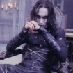
SPEAKING OF IMPACTFUL, WHEN WAS THE FIRST TIME YOU SAW THE MUSIC VIDEO FOR "CLOSER"? AT THE TIME, IT WAS CENSORED BY MTV.
That's a good question. It was affecting, but it wasn't totally striking in the sense that I was already used to intense visuals, being a fan of the metal, death-metal world and grindcore world.
I guess what was the most affective thing to me was just the packaging and the visuals, 'cause I was already working with found objects because I was a kid and didn't have any money and that was the way that I could ... I saw all this beauty around me, in all these things that were being deconstructed. I would try to photograph or photocopy this or do that and [Trent Reznor] was doing that, or at the very least partnering with artists and designers that were sharing that kind of vision and they were pushing it that much further. Mark Romanek, who did that video, clearly he found a partner in his vision.
I WAS REALLY YOUNG AND BECAUSE OF THE REPUTATION IT HAD, WHEN I SAW THE UNCENSORED VERSION, I FELT LIKE I WAS WATCHING SOMETHING I SHOULDN'T BE.
That's a great way to put it, right? 'Cause it just feels like it was just something totally, totally otherworldly.
It's funny. There was a lot of different visual stuff happening in the video medium back then, too. I think Tool hit probably a year or two before that, and so everybody was all about dark puppetry and there was this new visual language that was being discussed. It was just a huge turning point for aggressive music.
But before this happened, as industrial metal was happening and grunge was happening, funk metal was happening, too. That was a thing. You had like bands like Red Hot Chili Peppers and whatnot that were also hugely popular at the time. But then you had all of the thrash bands that were also being affected — they were either going more industrial or they were going more funk. It was a really confusing time for metal.
But what Nine Inch Nails and what Trent was attempting to do was something ... It wasn't necessarily new, it just was all the pieces were put together in a way that popular culture never saw. It was basically Joel-Peter Witkin, Francis Bacon, Ministry and good rock songs played in a different way. It was totally intense. No one ever experienced anything like that before and it was awesome.

YOU MENTIONED WORKING WITH "FOUND OBJECTS," AND IN THE SECOND LAYER OF YOUR PRINT, YOU CAN SEE INCORPORATED IN THE CORNER THE SHELL AS A REFERENCE. IT APPEARED AS THE HALO 9 "CLOSER TO GOD" SINGLE ARTWORK. I IMAGINE WHEN YOU SET OUT TO CREATE A PIECE, THERE'S ALWAYS THIS BALANCE OF CREATING A REFERENCE WITHOUT BEING TOO OBVIOUS.
Yeah, that was my on-the-nose tribute to it. Right. I just sort of let it develop. I have a cut-and-paste style that I like to just call like a fine-art approach to flyer-making. It's high-contrast work. That's basically that flyer-style art, that in collage-style art that was popularized by bands like Napalm Death, Carcass and the early Earache stuff.
I like to sort of create ominous figures out of shapes, out of gouache and cut-and-paste and collage work and stuff like that, 'cause everybody will relate to a human figure, right? You find yourself in it somehow, and just relate to it. So, looking at this more as an assignment, that's the first thing I thought of. I was like, "OK, well I need to connect with an audience and I need to have some sort of visual nod, and what are the things that connect with me visually with a band like Nine Inch Nails?"
I just started experimenting with those ideas and trying to encapsulate them in one singular piece. You know, the clock's ticking, you can only go so long. I could infinitely work on something and probably have 40 versions of that. But I had a basic idea and basic structure and knew that I wanted to add something that people who were familiar with my work to know that this was me. I wanted to have a little bit of my own recognizable aesthetic melding with the Nine Inch Nails' visual nod as well. I wanted to stick 'em all together and see what happens.

THE COLOR PALETTE YOU USED IS GORGEOUS: THE REDS, ORANGES, THAT DIRTY YELLOW, WHICH TO ME IS A CLEAR REFERENCE TO THE DOWNWARD SPIRAL ALBUM COVER COLOR ...
Yeah, it definitely is. Basically a whole lot of gouache and a whole lot of experimentation there. I built up layers on top of it and then I would play with those layers and introduce new colors and stuff like that and swap 'em out for other things. There was some stuff that was really dynamic in color that I felt broke too far from the visual character of what Nine Inch Nails is and what the time was. You know, when Trent and company were creating that album, it was a very focused vision. It might have had elements, a ton of different textural musical elements going on, but at the end of the day, you are still struck by this overall color palette and these really just strange, powerful, recognizable, but odd textures that weren't typical for an album cover at the time. You didn't really have too many abstract album covers in pop music then. You just didn't.
It wasn't a thing. So it made me go, "Well that's what works there," and you can do that and it can be entered. I knew that when I was a kid, that opened up a lot of doors for me. I said, "Oh, that's interesting. I can look at visuals that way. I don't need to think that everything needs to be wholly iconic." Then you can kind of go anti-icon, and still have it be as striking and successful. I just wanted to capture that in that work as well.
So I just kept playing and that's what you see is the end result. I bounced some ideas off of my pal, [tattooer and visual artist] Thomas Hooper, 'cause we work a lot together. As I was going, I said, "Thomas, what do you think of these colors?" I think I sent him a couple of works in progress, and he's like, "No, go simple." "Yeah, I think I'm going to go simple."

WAIT, YOU ASKED A GUY MOST KNOWN FOR HIS INCREDIBLY DETAILED WORK?
He knows I want to try to push. Right now, at least in my work, I feel very comfortable with color, I know color theory pretty well and I know what evokes emotion in me. So I do that, but it might not necessarily be the best decision for a piece. So sometimes you need to kind of step back to get some perspective and reflecting with Thomas on it definitely allowed me to go, "Yeah, you know what? You're right. I need to step back, and I need to speak the Nine Inch Nails' language, not just my own contemporary language in terms of visuals."

IN TERMS OF THE ALBUM ITSELF, IS THE DOWNWARD SPIRAL SOMETHING YOU REGULARLY GO BACK AND LISTEN TO, OR DOES REPRESENT A PARTICULAR PERIOD IN YOUR HISTORY?
Just as anybody else who has impactful music in your life, you go back and you listen to your favorites. You listen to those choice albums or those choice songs especially from impressionable years — your teen years or 20s, certain impactful moments in your life when you give yourself to music wholly.
I pay attention to Nine Inch Nails on the periphery for sure in terms of what Trent's up to now and how he's continuing to push what he does and what he brings to the creative table, because there aren't that many artists like him that have gone through a variety of stages of creative chapters, but his voice still resonates. He hasn't really faltered there.
But you know, "Closer," and obviously "Hurt" are songs that sort of transcends genres. To me, "Hurt" is the song that defines that album, though there's so many other moments that can connect with people. "Hurt" is The Downward Spiral to me.

MY FINAL QUESTION IS CONVERGE-RELATED. WITH THE 7-INCH OF "I CAN TELL YOU ABOUT PAIN"/"EVE" AND THE SHIRTS PRINTED AT THE TIME — I NOTICED THE WORD "CONVERGE" WAS IN A BOX LIKE HOW NINE INCH NAILS STYLIZES THEIR LOGO. WAS THAT HAPPENSTANCE?
It's not happenstance. When you start a band when you're a kid, 'cause we started this band when I was, I don't know, 13 years old — I was a child, when we came up with the name. It was first-level, but it wasn't hyper poetic. We're teenagers starting a hardcore band and the name is … it's just there for me. The name has never been a name where it strikes this huge emotional chord with me.
It's about our body of work more so. That's why I've always played with the visuals in the sense that the story of the character of the band is told through visuals, not necessarily like a logo. So Metallica, you think the classic lightning bolt logo — that's the logo. They can do anything that they want, but that's the logo. It doesn't matter if they use it or not on a record. That's still the logo. That's what defines finds them.

RIGHT, CONVERGE IS A VISUAL AS OPPOSED TO A WORD — LIKE PEOPLE RECOGNIZE JANE AND ALL OF YOUR EVOLUTIONS OF HER AS THE BAND.
I've even dropped band names off of covers a number of times because they feel distracting sometimes. I started playing with the idea of the logo and giving it different treatments over the years. I started playing with some tour poster visuals a number of years ago and I came up with the box logo that was an homage to that Nine Inch Nails box logo that they used to do on the back of, well, it happened on a variety of things, but the place where I found it most impactful was on the back of T-shirts in the early Nineties. That was just really striking, 'cause it was really simple and it's really symmetrical and just kind of bold. I started playing with flipping type on itself and I came up with a few different ways. So yeah, there's the four letter count and then there's the stacked two-letter count version. They're homages, but they're their own thing. They also give it a different voice. It makes the name less important to me, but still as impactful as a NIN logo.
I don't think people are that open talking about that sort of thing. Visuals are all about evolution. You don't always have to reinvent the wheel. You can just extend the life of something by redesigning it and giving it some new life. I mean, how many records probably came out with all lowercase type after The Downward Spiral? Everybody wanted to [Laughs], like, all of a sudden everybody went lowercase, "It has to be lowercase!"
There'll always be trends and things like that. As a band we're just fans of stuff and we don't claim to reinvent the wheel. We just try to put things together to speak our own kind of language and I think we do a pretty good job of that collectively.